To access a Menu Button's Properties window, double click the button or right-click the button and select 'Properties' in design mode within the Food Menu Designer. In this window there are two tabs: Main and Button Colors and Size. This window contains the Caption (button text), product association (if applicable), button sizing tools, and 'About Information.' About Information is content that will be displayed during order entry when the 'About' button is pressed at the bottom of the screen. Ingredients, special instructions, or warnings are most typically contained in the 'About Information' of a button.

If a Menu Button has a Product saved in the Product field, that product is associated to the Menu Button. During order entry, the information stored in the associated product will be reflected on the order ticket when it is pressed. This information includes Receipt Description and Price. The chosen item will also print on the Prep Ticket in the Prep Location designated in the associated product.
Menu Button Properties
To access a Menu Button's Properties window, double click the button or right-click the button and select Properties in design mode within the Food Menu Designer. In this window there are two tabs: Main and Button Colors and Size. This window contains the Caption (button text), product code association, the About Information, and the ability to enable or disable the button based on certain days or times. During the times the button is not "Enabled", the button will still appear but it will be grayed out and cannot be selected when taking an order.
About Information is content that will be displayed during Order Entry when the 'About' button is pressed at the bottom of the screen. Ingredients, special instructions, or warnings are most typically contained in the About Information of a button.
Note: If a Menu Button has Include Items associated with it, the Menu Item MUST have a product filled in to work properly.
Item Button
An Item Button is a terminating button. This button is used when the item being selected during ordering needs no modification and can be ordered as is. Modification is defined as additional specifications that further define an item or specify items to be included with the item.

Item Button Properties
To access an Item Button's Properties window, double click an item button or right-click an item button and select 'Properties' in design mode within the Food Menu Designer. When creating a new Item Button, the properties windows is immediately displayed. In this window there are two tabs: Main and Button Colors and Size. This window contains the Caption (button text), product code association, the About Information, and the ability to enable or disable the button based on certain days or times. During the times the button is not "Enabled", the button will still appear but it will be grayed out and cannot be selected when taking an order.
About Information is content that will be displayed during Order Entry when the 'About' button is pressed at the bottom of the screen. Ingredients, special instructions, or warnings are most typically contained in the About Information of a button.
List Button
List Buttons are used on a terminating path in the menu to designate a specific item to be added to the ticket that can be chosen from a list. For example, if there are flavors of soft drinks that the restaurant offers, those can be included in a list and display when the List Button is pressed which contains that list. The pre-defined list of available items for that button display and the operator can select from any one of the items on the list.

List Button Properties
To access a List Button's Properties window, double click the button or right-click the button and select Properties in design mode within the Food Menu Designer. In this window there are two tabs: Main and Button Colors and Size. This window contains the Caption (button text), the About Information, and the ability to enable or disable the button based on certain days or times. During the times the button is not "Enabled", the button will still appear but it will be grayed out and cannot be selected when taking an order.
About Information is content that will be displayed during Order Entry when the 'About' button is pressed at the bottom of the screen. Ingredients, special instructions, or warnings are most typically contained in the About Information of a button.
Allow Partial Portions check box - This sets a property that allows this item to be included with the whole, half, or quarter setting when ordering a pizza. Use this when an item can be put on a half or a quarter of a pizza.
Allow Multiple Portions check box - This allows this item to be doubled if extra amounts of the item are desired.
Selection Required check box - this forces an item to be selected. The user cannot exit a screen without selecting an item on the list if this box is checked. When the Selection Required check box is checked, the button turns yellow indicating that a selection is required.
Selection List - This is a list of the items that can be selected after pressing this button. The text from the list will replace the caption of the button once an item has been selected from the list. To change the selection, simply press the button again and the list will reappear. Choose a different item and it will replace the current item on the button caption and on the order ticket.
Button Sizing Adjustment Tools - These settings display and determine the position of a button in relation to the top and left sides of the screen and the dimensions of a button in pixels. In addition to dragging a button to a location or selecting the button and dragging the handles to resize it, these settings can make microscopic adjustments to the size and position of a button.
About Information
On the About Information tab, content is stored that will be displayed during Order Entry when the About button is pressed at the bottom of the screen. Ingredients, special instructions, or warnings are most typically contained in the About Information of a button.
Include Button
Include Buttons are typically used when ingredients are to be included/excluded during preparation of a food item. Preparation of those food products would include/exclude the items indicated as modifiers to a menu item on a ticket.

Include Button Properties
To access an Include Button's Properties window, double click the button or right-click the button and select 'Properties' in design mode within the Food Menu Designer. In this window there are two tabs: Main and Button Colors and Size. This window contains the Caption (button text), product code association, the About Information, and the ability to enable or disable the button based on certain days or times. During the times the button is not "Enabled", the button will still appear but it will be grayed out and cannot be selected when taking an order.
About Information is content that will be displayed during Order Entry when the 'About' button is pressed at the bottom of the screen. Ingredients, special instructions, or warnings are most typically contained in the About Information of a button.
Allow Partial Portions - This sets a property that allows this item to be included with the whole, half, or quarter setting when ordering a pizza. Use this when an item can be put on a half or a quarter of a pizza.
Allow Multiple Portions - This allows this item to be doubled if extra amounts of the item are desired.
Normally Included - This check box is used if there is a special item chosen that has ingredients that are normally included during the preparation of this item. To set this item, check the Normally Included box. This automatically turns the item green indicating that it is to be included with the chosen menu item. If this ingredient or specification is not desired during Order Entry, the user presses the green button and it turns red and adds the word 'NO' to the caption. For example, if the Include Button were green (indicating that it is Normally Included) and had the word 'Mustard' on it and the operator pressed it, it would turn red and read 'No Mustard.'
Button Sizing Adjustment Tools - These settings display and determine the position of a button in relation to the top and left sides of the screen and the dimensions of a button in pixels. In addition to dragging a button to a location or selecting the button and dragging the handles to resize it, these settings can make microscopic adjustments to the size and position of a button.
Gift Card Menu Setup
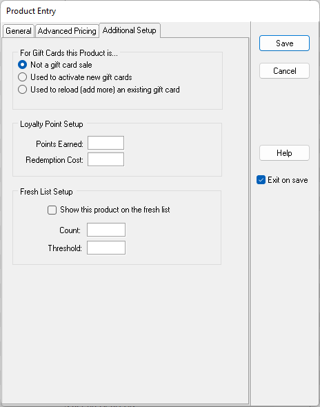
To set up a gift card for purchase, the following is recommended:
1) All gift card denominations can be set up using 'Item' buttons.
2) Set up each gift card as a separate button.
3) Associate the product code of the gift cards in the Item Button Properties.
4) Set up an Item Button for a miscellaneous gift card amount if desired. (use the 'Ask Price' check box on the Product Code setup screen.)

5) Set up any 'Reload' buttons using the 'Use to reload (add more) an existing gift card' radio button.
About Information
On the About Information tab, content is stored that will be displayed during Order Entry when the About button is pressed at the bottom of the screen. Ingredients, special instructions, or warnings are most typically contained in the About Information of a button.
The magnifying glass icon adjacent to the fields represents a search. To search the data stored from the field or to add additional data to the list, press the magnifying glass and the search / edit / add screen will appear. In most cases the user has the ability to add or remove records as well as locate records using this key.
